(Rainbow) Inclusivity and (Optional) Exclusivity Update

Proud to present an inclusive update; With an (optional) moving rainbow background and an expansion on the visual settings! Not only that, the menu itself received updated logic, a visual overhaul, new buttons, multi-page capabilities and is now scrollable. Code behind all of this is now more versatile and reusable; the rainbow background shares both logic and markup with 2 other optional backgrounds that work in similar fashion; “Red, White & Blue” and “Jah Bless!”.

“Initially I wanted to push out this update over the previous weekend, but am glad I didn’t; Otherwise I would’ve introduced you to some nasty bugs and would’ve felt the need to do emergency patch work ..or do a roll-back of the code-base!!” 😉

Inclusivity can be awesome; I love treating people as equal! When it’s similar to this form, so outside of divisive activism or arbitrary “pride months“! Equally a little Nationalism doesn’t have to offend or completely alienate people either. Not wanting to go into diatribe; just mentioning it as I also implemented a (Dutch, French or American?) red, white and blue -theme as well as a Rastafarian color-schemed background with this update.

“Showing some love for my LGBTTQQIAAP Lesbian, gay, bisexual, transgender, transsexual, queer, questioning, intersex, asexual, ally & pansexual-brethren, sistrin and everything in-between or outside that group!”

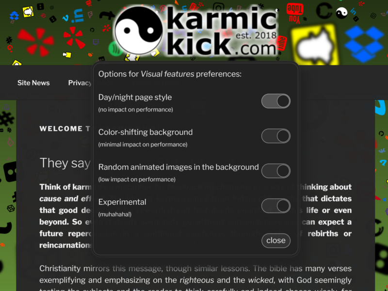
The mention of “exclusivity” is because also this update offers more functionality in adjusting (and/or disabling) visual features; Speeds can now be adjusted and transparency of the foreground-page two! Mobile devices should notice a slightly more transparent background (by default), bc these most screens on these devices offer less space around the page, obscuring the background animations otherwise. Check them all out, tweak them, by clicking the ‘Visual Settings’ option in the top-menu.

Work in this update should make it a lot easier to offer (future) choices of animated Nation-flag-colored themes and should help working towards offering choice of animated icon-themes in a future update two. Just needing to find the time to distil nations colors, name them in inclusive manners and draw some unique icons down the line, as ‘ripping’ icons from somewhere else isn’t my style!

<techno-babble>
//This might go over some of your heads; about this updates implementation’s-techniques..
The new moving backgrounds in this update are original and by hand; Endless diagonal scrolling gradients. I’ll share an example below. Also I had good fun polishing up the menu itself and implemented new ‘toggles’ that mimic option-lists and multi-value settings. The revamped the color-code and markup now offer a wider spectrum, allowing more edge-cases, settable in speed and faster to react to day-night theme-switching.

Next update I hope the expand on the application of these, hoping to implement multi-color variants of random shifting backgrounds, perhaps layering and fading into and out of backgrounds. I also have some snazzy static geometric backgrounds (from other creators) lined up, hoping to offer these as both static and animated options.

If you’re interested in the test-branch of the code-base, you can open the site with a special ‘arguement’ (“?experimental”) on any page or by clicking here. Doing that you’ll notice new options in the visual menu, hidden to normal visitors.
</techno-babble>

I already touched on the subject of errors and bugs; I have built, tested (somewhat thoroughly) and postponed this update and even got some help from friends (my thanks!). The most obvious mistakes have been tackled, yet some errors and crashes could still occur.. Specifically I’ve noticed animating the background-images does still take a lot memory, though it shouldn’t be problematic to modern computers and mobile devices. If you do notice any instability or have feedback, you are free to reply here (below) or on Facebook.

Happy to announce that FB, in the meantime, granted my page a unique and less cryptic identifier, so “KarmicKick” is now more searchable and identifiable there! Also contemplating getting back on Twitter, not as a person, but as a Media-entity. Beyond that I will certainly try to focus on getting presence on Youtube. So I will be doing some trial recordings soon(-ish)!

Work on this update started off with a typo from a friend giving me the idea for a background aimed at rainbow inclusivity.. If you have feedback or a good idea; let me know so I may ponder and/or incorporate your idea 💡


As promised; a (simplified) example of the moving rainbow style-markup;

<style type="text/css">
.bg-panel.moving-rainbow { /*repeat colors so the transition is seamless*/ background: linear-gradient(135deg, rgb(255,36,0), rgb(255,6,6), rgb(255,197,5), rgb(251,255,5), rgb(5,255,47), rgb(5,243,255), rgb(9,5,255), rgb(221,0,243), rgb(221,0,243), rgb(255,36,0), rgb(255,6,6), rgb(255,197,5), rgb(251,255,5), rgb(5,255,47), rgb(5,243,255), rgb(9,5,255), rgb(221,0,243), rgb(221,0,243), rgb(255,36,0)); background-size: 200% 200%; -webkit-animation: diagonal-path 12s linear infinite; -z-animation: diagonal-path 12s linear infinite; -o-animation: diagonal-path 12s linear infinite; animation: diagonal-path 12s linear infinite; } @-webkit-keyframes diagonal-path { 0%{background-position:0% 0%} 100%{background-position:100% 100%} } @-moz-keyframes diagonal-path { 0%{background-position:0% 0%} 100%{background-position:100% 100%} } @-o-keyframes diagonal-path { 0%{background-position:0% 0%} 100%{background-position:100% 100%} } @keyframes diagonal-path { 0%{background-position:0% 0%} 100%{background-position:100% 100%} }
</style>

Lead by Example

Added a custom Night-mode and Option Dialog

I quietly designed and implemented a dark theme or ‘night mode’ and built a custom options menu, but with snazzy transitions! Both are still new and need to be finetuned some more, but should already work well on desktop and mobile devices, so I have now enabled both for as options for you to use via the top-menu -> click ‘visual setting’ to try them!

The options menu itself is pretty cool two; instead of opting for an off-the-shelf solution (there are many), I designed and coded my own! Taking inspiration from modern cookie-permission menus, seen across the web; I designed some fancy ‘radio-buttons’. All of which are done in web-media standard CSS Cascading Style Sheets and jQuery/Javascript.

It has been a longtime wish to also options to disable the background animations for users that don’t want them.. So I added those as options two!

For now I’ve added these options under a singular main menu option that’ll only highlight by the adding ‘(new)’ to que usage, but in a future addition to my scripts I’ll add animated ques for users that haven’t used (set) preferences. I’ll also look at making the dialog do scrolling for really small mobile screens, for now it should just about fit most screens. (I hope; let me know if yours doesn’t or if you have any other feedback, here or on Facebook, a link is in the ‘footer’).

“KarmicKick has been secure since 2018, see the little lock-symbol and note the address features a ‘https:‘ ahead of the domain name. It remains in development and at this point I will focus more on writing actual articles to publish on the platform!”

I did add some copyright disclaimers to my scripts as I don’t like the idea of my work being copied willy-nilly. Sure one can look at and take inspiration from my scripts and mark-up, but ripping and reusing I frown upon! I am available for custom work on -and-off-site 😉 😉

Custom Solutions

Zen and the art of Website-maintenance

Keeping the website up and running is no effort, but keeping it fresh and filled has been a challenge to put it mildly! Recent life events and societal phenomena but are best typified by the term upheaval. Moving house through the health-scare and dealing with the influx of news has been chaotic and laid claim to most of my attention. Though lately I have found renewed energy and drive to clean house and make time for my own endeavors.

On the website end this means I have done lots of small tweaks and technically changed a lot of layout practices, something that is an ongoing effort. Visually I updated the logo and revised my background animation-script. I also rewrote the frontpage text to be less politically colored as I hope to do more media-creation and a broad manifest style statement on the frontpage could put readers and viewers off..

On the home front I have been gaining energy from taking things step-by-step, taking more joy and energy from actively getting small things done. Not just being goal oriented, but rather during the activities that seem mundane and menial. This helps actually doing them and taking pleasure from things even before seeing noticeable results.

Being a an (ex-professional) web developer I want to stay on top of newer developments and compliance, for instance working on decent social media integration and presence. To this end I upgraded some structures, upgraded some code, so now previews on social media will display imagery from content and not the site logo.

I expanded on my earlier custom background animation script adding functionality for per-page customization (and ‘intelligent’ defaulting) of hashtag displayed in the upper left corned of all pages. Also I added another idea in the code; fluctuating gradient colors! This helps the pages look less static, though the shifting is very subtle as to not take away too much attention from content.

I do hope to get some feedback one of these days on the background, bc I have no real idea on how (or if) the visitors experience is influenced. Most of the reactions I get directly on-site seem to be from spam-bots that are all to willing to fill out the ‘website’ field in the forms below my pages. I will be changing the accompanying text to dissuade (real) visitors from filling that field, bc I don’t have time to check and verify sites in reactions, so I usually just ignore them. Fearing most are automated, malicious and purely commercial attempts to flatter me in the hopes I’ll repost their comment (and all too obvious; their links!).

I also silently added a new page to track, test and demonstrate the sites markup (linked below). It’s nothing to brag about, but a nice aid and reference (mainly to myself).

Markup Feature Demonstration

Zen

Markup Feature Demonstration

I learned a few important lessons editing, proofing and publishing books; consistency in layout is key, text reads easier when justified and using footnotes helps both the readers that are up to speed as it does those who want more background information. Being a coder and web-designer from an early age also taught me to use and build solutions to accommodate readers with visual ques and small aides, like tooltips for abbreviated definitions and tools for viewing images, or emoticons. 😎

-reminder to add a custom lightbox(!)

This page is mostly a demonstration and a reminder to myself; so I have a reference to usability-features and as a compliancy test-case(!) These days most browsers are pretty decent at rendering pages with little need for specific codes, but it helps to test and remind me of things I built and don’t frequently use. Like the Hashtags that show up at the top of the page that can (now) be overridden. And for future features..!

-“This text has emphasis..”

Paragraphs should justify nicely across the page, going all the way from left to right, by default.

Left aligning paragraphs are still possible, it just looks horrible to me, yet most websites don’t bother with it. Why? Idk, possibly they just can’t be bothered to consistently markup or don’t know how to change stylesheets..

This left aligning paragraph has a break above it..
,, and a new line inside the paragraph!

Right aligning paragraphs are still possible and possibly nice to get readers focus on something? Idk.


Justified H2 Headlines are now default, they just need to be long enough to notice!

Left aligning H2 Headlines are still possible

Justified H3 Headlines are now default, they also just need to be long enough to notice!

Left aligning H3 Headlines are also still possible


image with sub-text and picture frame

Blockquotes are always centered!

Even if blockquotes have paragraphs in ’em!

Hyperlinks: Links can have nice titles so the reader gets an idea what’s up, for instance: Hyperlink also mind it has a target ‘_blank’ so it opens in a new tab(!)

Footnotes: Sometimes definitions are unclear, but explaining them inline isn’t a great idea; then we can a reference to a Footnote1!

Tooltips for Abbreviations: Using obscure shorthand can leave readers puzzled, talking about web markup languages like ‘CSS Cascading Style Sheets‘ or ‘HTML Hyper Text Markup Language‘, using some script tooltips can go left, right, top or bottom of the defeinitions.
(!)I will have to see if I want to combine these with footnotes and automate numbering, if I ever feel the need(!)

Emoticons: smile: 🙂 razz: 😛 cool: 😎 wink: 😉 biggrin: 😀 twisted: 😈 mrgreen: :mrgreen: lol: 😆 rolleyes: 🙄 confused: 😕 cry: 😥 surprised: 😮 evil: 👿 neutral: 😐 redface: 😳 mad: 😡 eek: 😯 sad: 🙁 arrow: ➡ idea: 💡

<script type="text/basic">
10 print"Mind the special characters!"
20 goto 10
</script>

<style type="text/css">
.test{
	/*a test to see if tabs-are preserved*/
}
</style>

Place footnotes below a break, but the link above it; so the footnotes don’t get hidden behind the menu that’s a the top of the page. Also linking to a singular anchor helps keep things consistent and is less prone to mistakes. Place the anchor inside a hidden paragraph so it doesn’t take space in layout


footnotes:

1Footnotes rule! Use them!

Custom Hashtag

INCOMING MESSAGE! -Jetzt geht’s LIVE!- THIS IS NOT FAKE NEWS!

“Hey amigos and amigas!

-I’m somewhat proud and have been hesitant up to now, to give you all a first glance at this..”

I am busy getting this new .com-site in order; those of you who know me will know I like reusing and repurposing stuff.. Also you’d perhaps know I am opinionated and technically capable, as a web-developer, former statistical analist and volunteer amongst plenty of other specific and general interests.. I have insight, experience and often take time to delve into subjects that are prone to shifts or are yet unfamiliar to me.

Enough about me, this is about my site, which is still very bare bones and barren at the moment. If I put off showing this site until ‘it’s done’ that’d be a while still and wouldn’t motivate me as much to keep going, as when I know that people could be looking in on my progress.

With focus and activities as wildly varying as mine and without prying eyes; I did manage to hook all of you up with this-here secure website with no tracking and NO ADS! [And] before ‘launch’ I did feel I needed to stress my dedication to re-usage by creating a unique first version of a scripted background-animation, that reuses the (and randomises) the social icons already embedded in the page!

“-please let me know if the background animation is too much, if it makes your devices run hot, makes fans spin up ..or if it triggers a seizure!”

Anyway, I have plenty of reusability experience and some *fun* reusability-projects planned, next to wanting to reflect & interject on current affairs and trends.

“-feel free to comment here or via social, directly or publicly. I love getting constructive critiques, positive, negative, funny, indifferent or oppositional, any feedback is welcome <3″


#Reusing, reporting and reflecting on the current state of “the interwebs”, internet-trends, web-development, high-end work-stations, “modding”, nature and politics..
,, occult knowledge, (fake) news, censorship, identity politics, mis-information, tailored science, post modernism, humanism & mind control.

Yay another few steps!

So proud already of my little project! It’s still in it’s infancy, but we’re taking steps and learning to walk. Pretty soon I might even take time to add actual content!

Yay Secure SLL / Animated background script / Page Consistency / Policy !

Since my last post I worked on keeping the styles minimal and getting them (more) consistent across pages. While keeping bells and whistles intact I added scripts, styles and hookups for (my custom) minimal animated backgrounds; Using minimal elements like ‘svg-imagemaps’ animated by triggering/randomizing ‘css’ (style) through javascript.

Granted I still need to write a ‘toggle’ to switch the added behavior off, I decided to add some animation for now. Currently it stops after filling background with social icon images. Perhaps I can even get it to visually mash with ‘nighttime theme’ at some point, I haven’t tried but can imagine most of the effect will be lost in darkness.

Meanwhile I also got an automated nudge to add a ‘privacy policy’ to the site, so I also took considerable time to flesh-out some of my thoughts on privacy and policy as it applies here. *not at all important for the current format and still subject to change!

Procrastination Style Development

Building websites is my thing, but usually involves me receiving external input and direction. This site being my own, it’s up to me to decide on a style and layout.

Being an indecisive turd when it comes to larger questions in life, the indecisiveness in choosing a theme, color-pallet and layout is not surprising! Luckily I am versatile in throwing things together and radical change-ups in style on running projects.

For now let’s go with a bland, understated look. At least I decided on a logo that’s recognisable and pretty well suited to karma and kicking.

Playfully kicking against aspiring power structures, new technologies, social trends, censorship, taboos, dogmas, ideologies and activism. Shit sticks/stinks and irrational arguments are usually hollow and not structurally sound. I see plenty of things to highlight daily, so much so that the reoccurrence of BS seems rhythmic and patterned(!)

Sadly over time we are in a loosing game against outrage-culture; progressively giving up rights, privacy (, language, ..) for a false sense of security. I don’t like ‘alarmists’ and ‘activism’, because of the sad state both have devolved to; ‘virtue signaling’ and unreasoned repeating of mantra’s (and violence).